Analysing Maccabi data on initial efficacy of first vaccine dose
This exciting chart has emerged from the Maccabi study, providing evidence for efficacy of the Pfizer vaccine after the first dose.
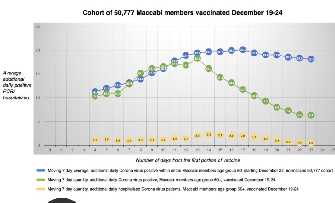
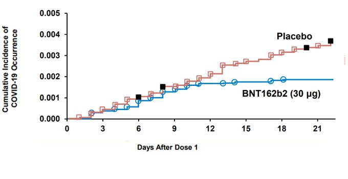
As Eran Segal pointed out on Twitter, the blue line actually includes the green line. I was interested to see what this would look like replotted as a Kaplan-Meier curve like the Pfizer graph.
size_of_cohort = 50777
size_of_all_members = 480000
size_of_unvaccinated = size_of_all_members-size_of_cohort
data = data %>% mutate(new_infections_all_members = AllMembersNormalised*size_of_all_members/size_of_cohort)
data = data %>% mutate(new_infections_unvaccinated = new_infections_all_members - VaccinatedCohort)
data = data %>% mutate(daily_incidence_unvaccinated = new_infections_unvaccinated/size_of_unvaccinated)
data = data %>% mutate(daily_incidence_vaccinated = VaccinatedCohort/size_of_cohort)

graphdata = data %>% select(c(Day,contains("daily_incidence"))) %>% pivot_longer(-Day,names_to="group",values_to="daily_incidence") %>% separate(group,into=c("bla","bla2","condition"),sep="_") %>% select(-contains("bla")) %>% group_by(condition) %>% arrange(Day) %>% mutate(cumulative_incidence=cumsum(daily_incidence))


graphdata$condition = ifelse(graphdata$condition=="unvaccinated","Control cohort",graphdata$condition)
ggplot(graphdata,aes(x=Day,y=cumulative_incidence,color=condition))+geom_line()+theme_classic()+labs(caption="Caveats: based on 7-day-moving average data so sharpness of start of initial efficacy will be understated. \n Control cohort may contain vaccinated people",color="Condition",y="Cumulative Incidence")+scale_color_manual(values=c("red","blue"))+geom_point()
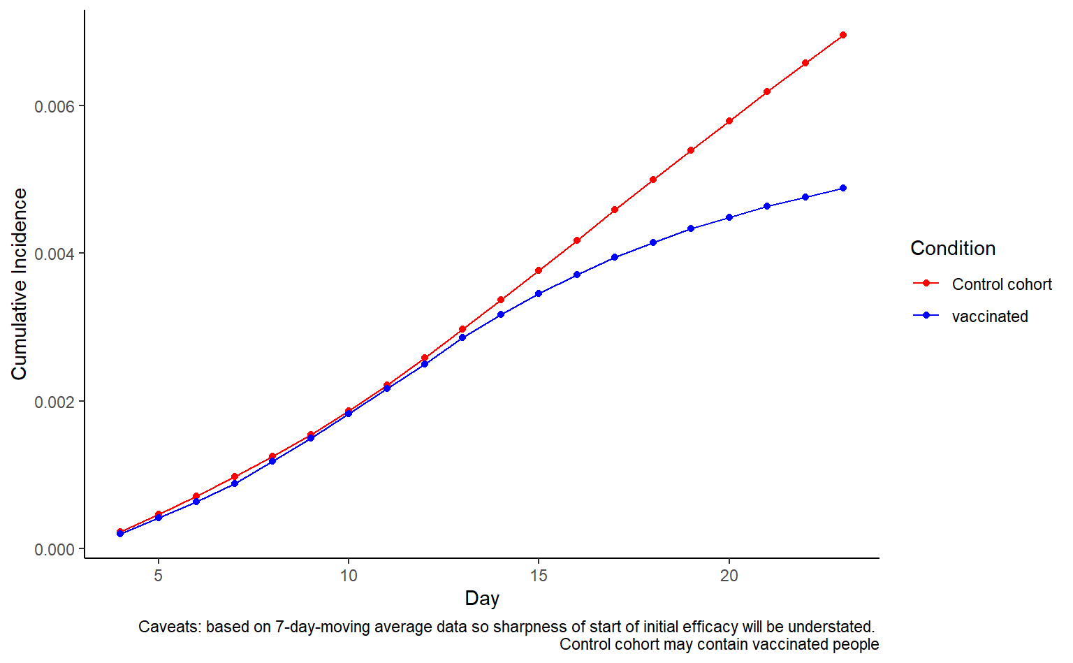
There are a lot of caveats about whether this is comparing like-for-like in terms of endpoint. In some respects it is definitely not, and everything is smoothed out by the 7 day moving average. In addition, this is a much older age group where we’d very much expect the immune response to take longer. Another really important caveat is that the blue line likely includes people who were vaccinated later on.
In general the top plot presented by Maccabi is much more useful for getting a sense of what is going on (what direction the lines are pointing at the end of the Kaplain-Meier plot).
Theo Sanderson
Assistant Professor
Biologist developing tools to scale pathogen genetics.