Investigating the latest round of REACT
The latest round of the REACT study has come out, and been quite controversial. Let’s examine some of the raw data behind it.
Let’s download the REACT data and process it into a nice format:
positive <- read_csv(url("https://raw.githubusercontent.com/mrc-ide/reactidd/master/inst/extdata/positive.csv"))

#> Warning: Missing column names filled in: 'X1' [1]

total <- read_csv(url("https://raw.githubusercontent.com/mrc-ide/reactidd/master/inst/extdata/total.csv"))

#> Warning: Missing column names filled in: 'X1' [1]
positive$type = "positive"
total$type = "total"
all = bind_rows(positive, total)
colnames(all)[1] = "Date"

all = all %>% pivot_longer(c(-Date,-type),names_to="Region") %>% pivot_wider(names_from=type)
all

#> # A tibble: 1,485 x 4
#>    Date       Region                   positive total
#>    <date>     <chr>                       <dbl> <dbl>
#>  1 2020-05-05 South East                      0   113
#>  2 2020-05-05 North East                      0    13
#>  3 2020-05-05 North West                      1    73
#>  4 2020-05-05 Yorkshire and The Humber        0    33
#>  5 2020-05-05 East Midlands                   1    77
#>  6 2020-05-05 West Midlands                   0    51
#>  7 2020-05-05 East of England                 0    93
#>  8 2020-05-05 London                          0    39
#>  9 2020-05-05 South West                      0    42
#> 10 2020-05-06 South East                      0    62
#> # … with 1,475 more rowsm
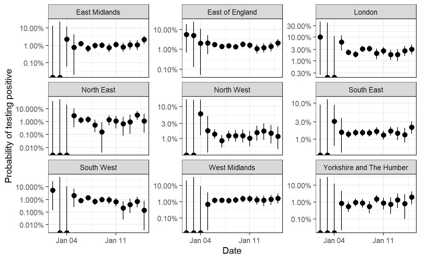
Now we can calculate binomial confidence intervals by location for each date and plot them.
all = all %>% filter(!is.na(positive)) %>% filter(!is.na(total))
library(binom)

cis = binom.confint(all$positive,all$total, method="exact")


all$lower=cis$lower
all$mean = cis$mean
all$upper=cis$upper

ggplot(all %>% filter(Date>"2020-12-15"),aes(x=Date,ymin=lower,ymax=upper,y=mean))+geom_pointrange(color="black") +facet_wrap(~Region,scales="free_y")+scale_y_log10(labels = scales::percent)+theme_bw() + labs(y="Probability of testing positive")

#> Warning: Transformation introduced infinite values in continuous y-axis

#> Warning: Transformation introduced infinite values in continuous y-axis
ggsave("plot.png",width=9,height=5, type="cairo")

#> Warning: Transformation introduced infinite values in continuous y-axis

#> Warning: Transformation introduced infinite values in continuous y-axis
This looks to accord well with the table of R values that REACT provide in Table 3: 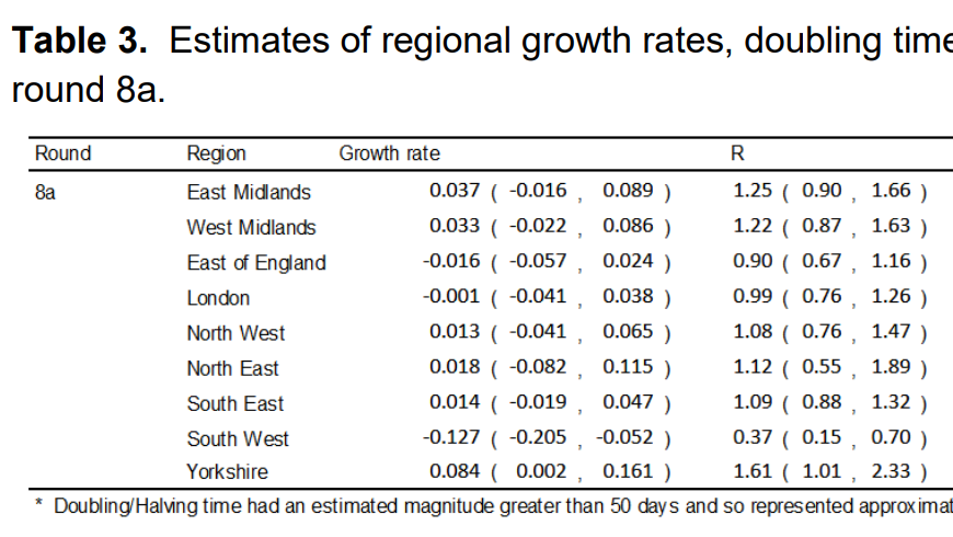
This isn’t especially surprising, but I think the visualisation helps to make sense of how these values came to be calculated (even though they are probably based on a more complex analysis weighting for various demographic factors).
That’s it for now.
Theo Sanderson
Assistant Professor
Biologist developing tools to scale pathogen genetics.