The virus vs. the vaccine
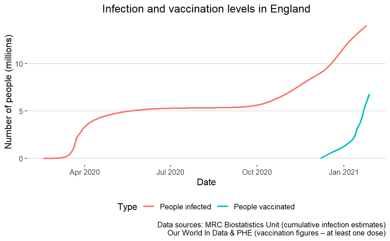
One framing for thinking about COVID is as a race between vaccination and infection, since we expect the former to have at least some mitigating effect on the latter. To get a sense for this I plot the cumulative infection estimates from the MRC Biostatistics Nowcasting Reports against the vaccination numbers from PHE (with historical data filled in from Our World in Data).
try(library(tidyverse), silent=TRUE)
library(jsonlite)
library(ggthemes)
a = fromJSON("mrc_biostats.json")
df=tibble(date=a[[1]],y=a[[2]])
df$date=lubridate::ymd(df$date)


df$label = "People infected"
b = read_csv("vaccinations.csv")
b$y=b$numFirstDose
b$date=lubridate::dmy(b$date)
b$label = "People vaccinated"
ggplot(bind_rows(df,b),aes(x=date,y=y/1000000,color=label))+geom_line(size=1) +labs(x="Date",y="Number of people (millions)",color="Type",title="Infection and vaccination levels in England",caption="Data sources: MRC Biostatistics Unit (cumulative infection estimates)\nOur World In Data & PHE (vaccination figures – at least one dose)")+theme_hc()++
  theme(plot.title = element_text(hjust = 0.5))
ggsave("plot.png",width=7.3,height=4, type = "cairo")
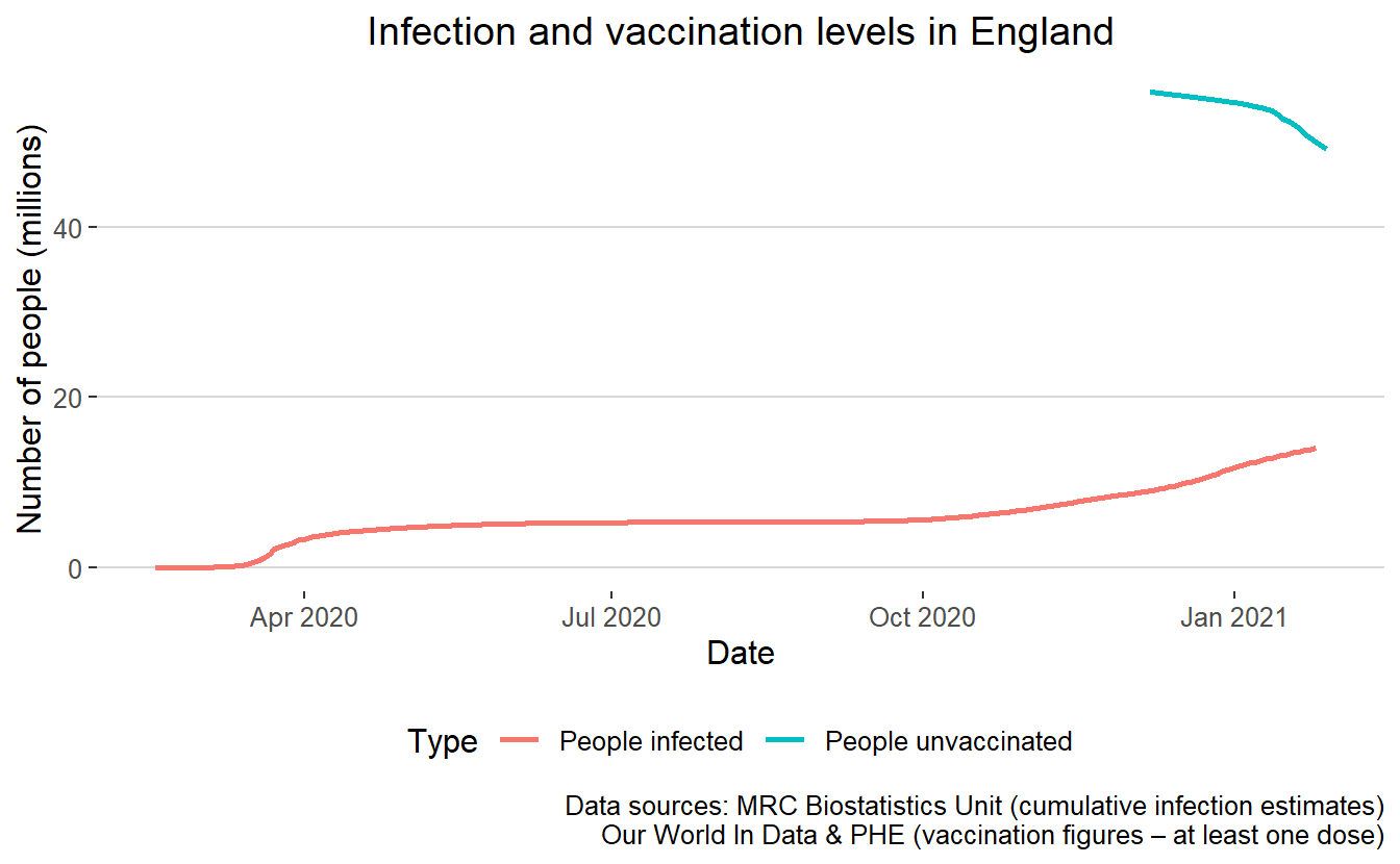
If we literally were to imagine vaccination and infection to be mutually exclusive (which clearly isn’t true in either direction), we could plot a graph like this to look at where they might meet.
c=b
c$label = "People unvaccinated"
c$y=56000000-c$y
ggplot(bind_rows(df,c),aes(x=date,y=y/1000000,color=label))+geom_line(size=1) +labs(x="Date",y="Number of people (millions)",color="Type",title="Infection and vaccination levels in England",caption="Data sources: MRC Biostatistics Unit (cumulative infection estimates)\nOur World In Data & PHE (vaccination figures – at least one dose)")+theme_hc()++
  theme(plot.title = element_text(hjust = 0.5))
ggsave("plot2.png",width=7.3,height=4, type = "cairo")
Theo Sanderson
Assistant Professor
Biologist developing tools to scale pathogen genetics.