Turning a graph back into data
Summary: The ONS Coronavirus Infection Survey is an immensely valuable scientific project measuring prevalence of coronavirus in the community. However some useful data have been released only in graphical form which makes them hard to re-analyse. Here I describe how I went about turning one of these graphs back into data in R and briefly explore what it can tell us about SGTF in samples today.
Background
The ONS infection survey is an extremely valuable and well-conducted piece of work. As I discussed in a previous post sometimes the raw data outputs can be subject to different interpretations.
One challenge in interpreting this data in that post was that information on the relationship between the number of genes detected and the distribution of Ct values was not available. I resorted to examining this by calculating the Ct value in different regions, and relating this to the area’s mean Ct value. But what I really wanted was a line list containing Ct value data for each test, along with how many genes were detected (and ideally further information).
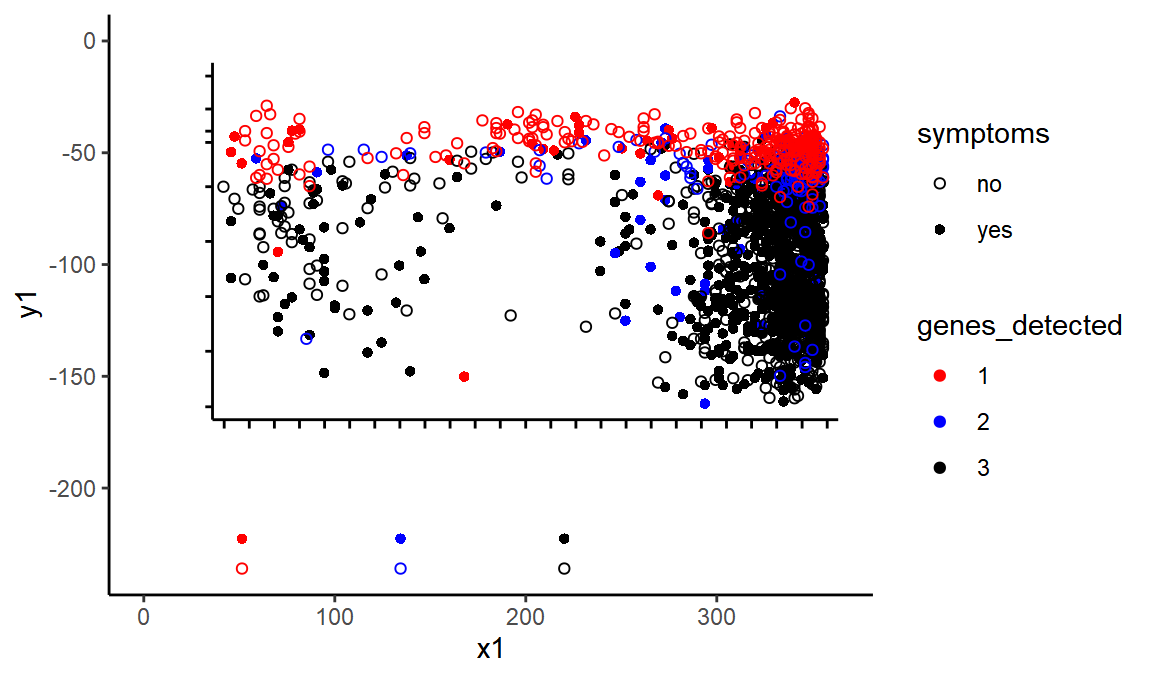
I have since discovered that some of this data is available in a preprint published by the survey team in October 2020. Specifically, for me - the most valuable data is the graph below, which depicts individual tests with their Ct values, symptomatic status, and number of genes detected.

Unfortunately this data is only presented graphically. But since the graphic is present in a vector format we may be able to get the data back out again without locating every point by hand. Here is how I went about this.
knitr::opts_chunk$set(dev.args = list(png = list(type = "cairo")))
require(xml2)
library(tidyverse)
library(lubridate)
library(rvest)
First we will read in the SVG file as XML and look at the straight lines - i.e. the axes, things like the axes and tick-lines.
theme_set(theme_classic())

doc <- read_xml("ons_scatterplot.svg") %>% xml_ns_strip()
lines <- xml_nodes(doc, "line")

linesdf <-
  tibble(bind_rows(lapply(xml_attrs(lines), as.data.frame.list))) %>%
  mutate_at(c("x1", "x2", "y1", "y2"), as.character) %>%
  mutate_at(c("x1", "x2", "y1", "y2"), as.numeric) %>%
  mutate(y1 = -y1, y2 = -y2) %>% # y-axis is reversed in SVG - screen format is from top left
  mutate(length = sqrt((x2 - x1)^2 + (y2 - y1)^2))
Let’s try drawing this set of lines in ggplot. We’ll colour them in by their SVG class to see what class corresponds to which items of the plot.
ggplot(linesdf, aes(x = x1, xend = x2, y = y1, yend = y2, color = class)) +
  geom_segment()
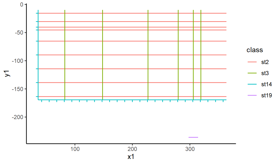
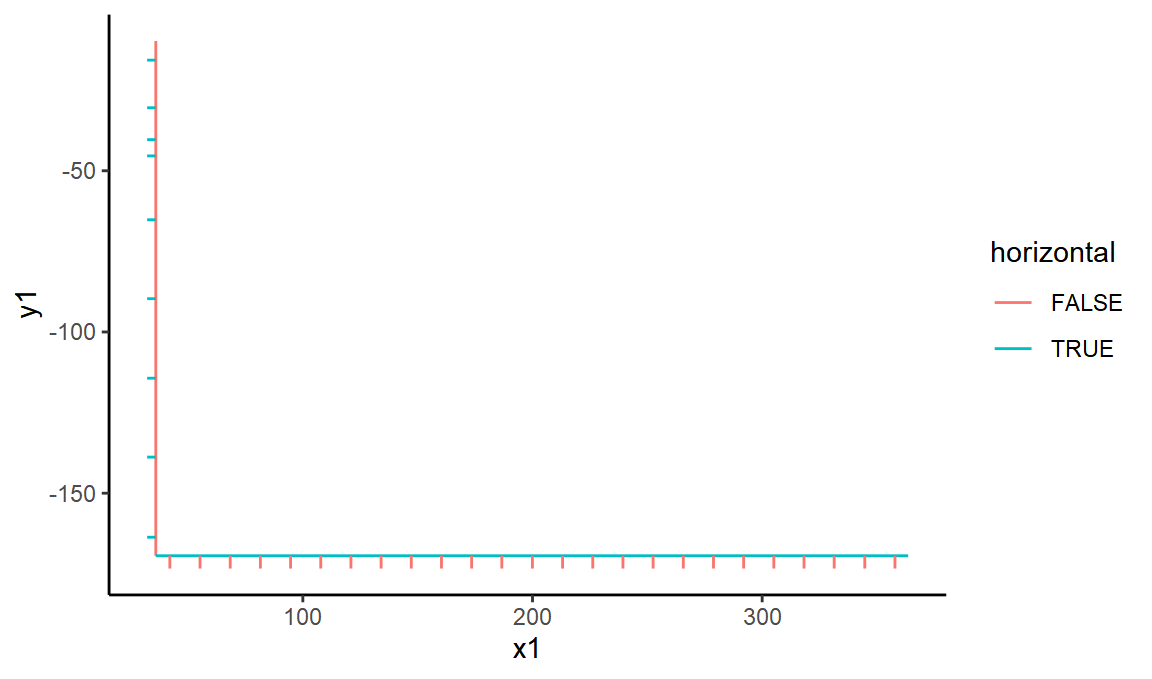
OK, so st14 represents the black lines of the axis - lets extract those and mark them each as horizontal or vertical.
black_lines <- linesdf %>%
  filter(class == "st14") %>%
  mutate(horizontal = abs(y2 - y1) < 10 * abs(x2 - x1)) %>%
  mutate(vertical = !horizontal)

ggplot(black_lines, aes(x = x1, xend = x2, y = y1, yend = y2, color = horizontal)) +
  geom_segment()
We can also look at the distribution of line lengths to be able to separate out the short ‘ticks’.
ggplot(black_lines, aes(x = length)) +
  geom_histogram()

#> `stat_bin()` using `bins = 30`. Pick better value with `binwidth`.
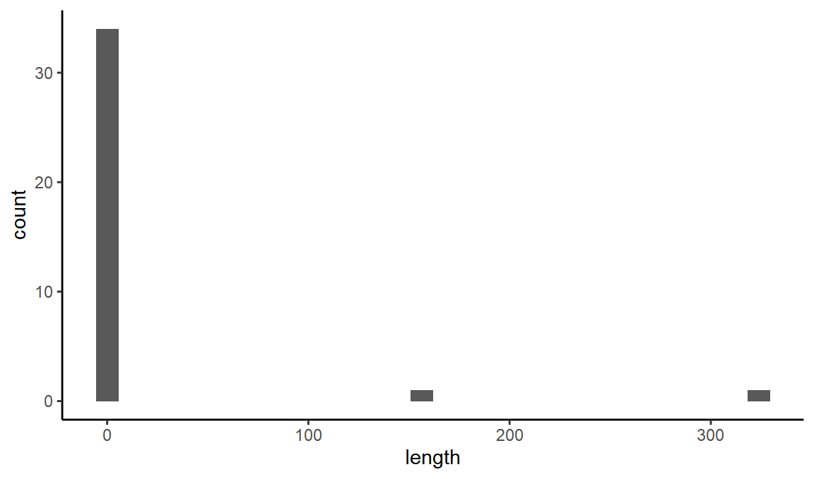
It looks like any line with length less than 30 will be a tick.
ticks <- black_lines %>%
  mutate(is_tick = length < 30) %>%
  filter(is_tick)
horiz_limits <- ticks %>%
  filter(horizontal) %>%
  filter(y1 == max(y1) | y1 == min(y1))
vert_limits <- ticks %>%
  filter(vertical) %>%
  filter(x1 == max(x1) | x1 == min(x1))


#ggplot(bind_rows(horiz_limits, vert_limits), aes(x = x1, xend = x2, y = y1, yend = y2, color = horizontal)) +
#  geom_segment()
Now we can extract the positions of the maximum and minimum tick for each axis, and manually write in the real values those correspond to from the label:
x_min_svg <- min(vert_limits$x1)
x_max_svg <- max(vert_limits$x1)
y_min_svg <- min(horiz_limits$y1)
y_max_svg <- max(horiz_limits$y1)
We’ll also manually enter the corresponding real values from the tick labels
We’ve dealt with the axes. Now time to move onto the points. Unfortunately they are not points, they are paths (bezier-curves), drawing circles to represent points!
Here is a tool I found useful for interpreting SVG commands.
We’ll extract all the paths.
paths <- xml_nodes(doc, "path")
And then try to split up the bezier curves into sub commands, like M (move to a point), C draw a curve in absolute coordinates, c draw a curve in relative coordinates, and so on.
pathsdf <-
  tibble(bind_rows(lapply(xml_attrs(paths), as.data.frame.list))) %>%
  mutate(id = 1:n()) %>%
  mutate(d = gsub("S", "|S", d)) %>%
  mutate(d = gsub("s", "|s", d)) %>%
  mutate(d = gsub("z", "|z", d)) %>%
  mutate(d = gsub("c", "|c:", d)) %>%
  mutate(d = gsub("C", "|C:", d)) %>%
  mutate(d = gsub("M", "M:", d)) %>%
  mutate(d = gsub("\n", "", d)) %>%
  mutate(d = gsub(" ", "", d)) %>%
  mutate(d = gsub("([0-9])-", "\\1,-", d))

commandsdf <- pathsdf %>%
  separate_rows(d, sep = "\\|") %>%
  filter(d != "z") %>%
  separate(d, into = c("command", "parameters"), ":")

#> Warning: Expected 2 pieces. Missing pieces filled with `NA` in 24 rows [23, 25, 28, 30, 7933, 7935, 7938, 7940, 8673, 8675, 8678, 8680, 16233, 16235, 16238, 16240, 16243, 16245, 16248, 16250, ...].


commands_processed <- commandsdf %>%
  separate(parameters, into = c("p1", "p2", "p3", "p4", "p5", "p6"), sep = ",") %>%
  mutate(abs_x = case_when(command == "M" ~ p1, command == "C" ~ p5), abs_y = case_when(command == "M" ~ p2, command == "C" ~ p6)) %>%
  mutate(rel_x = case_when(command == "c" ~ p5), rel_y = case_when(command == "c" ~ p6))

#> Warning: Expected 6 pieces. Missing pieces filled with `NA` in 3796 rows [1, 6, 11, 16, 21, 26, 31, 36, 41, 46, 51, 56, 61, 66, 71, 76, 81, 86, 91, 96, ...].
These circles in SVG form curves, with 4 control points. If we take the average of these we can find the position of the point. One of the points is absolute, from the M coordinates, but 3 are from c commands, and they only have relative coordinates, so we need to calculate the cumulative sums of these, and then add them to the M coordinates. Then we’ll average out, and add back the class metadata.
lowercase_cs <- commands_processed %>%
  group_by(id) %>%
  filter(command == "c") %>%
  mutate(rel_x_sum = cumsum(rel_x), rel_y_sum = cumsum(rel_y)) %>%
  select(id, rel_x_sum, rel_y_sum)

zeroes <- lowercase_cs %>%
  group_by(id) %>%
  summarise(rel_x_sum = 0, rel_y_sum = 0)

#> `summarise()` ungrouping output (override with `.groups` argument)


full_relative_set <- bind_rows(lowercase_cs, zeroes)

uppercase_cs <- commands_processed %>%
  filter(command == "C") %>%
  select(id, command, abs_x, abs_y) %>%
  mutate(abs_x = as.numeric(abs_x), abs_y = as.numeric(abs_y))

both <- inner_join(uppercase_cs, full_relative_set, by = "id") %>% mutate(x = abs_x + rel_x_sum, y = abs_y + rel_y_sum)

point_types <- pathsdf %>% select(id, class)

points <- both %>%
  group_by(id) %>%
  summarise(x = mean(x), y = mean(y)) %>%
  inner_join(point_types, by = "id") %>%
  mutate(y = -y) %>%
  filter(class %in% c("st10", "st7", "st9", "st12", "st11", "st5"))

#> `summarise()` ungrouping output (override with `.groups` argument)
Above you can see I have filtered to only some of the classes. This is because some points were represented by two curves, one a stroke and one a fill. Now let’s plot the points.
ggplot(black_lines, aes(x = x1, xend = x2, y = y1, yend = y2)) +
  geom_segment() +
  geom_point(data = points %>% mutate(x2 = 0, y2 = 0), aes(x = x, y = y, color = class)) +
  scale_color_brewer(type = "qual", palette = "Paired")
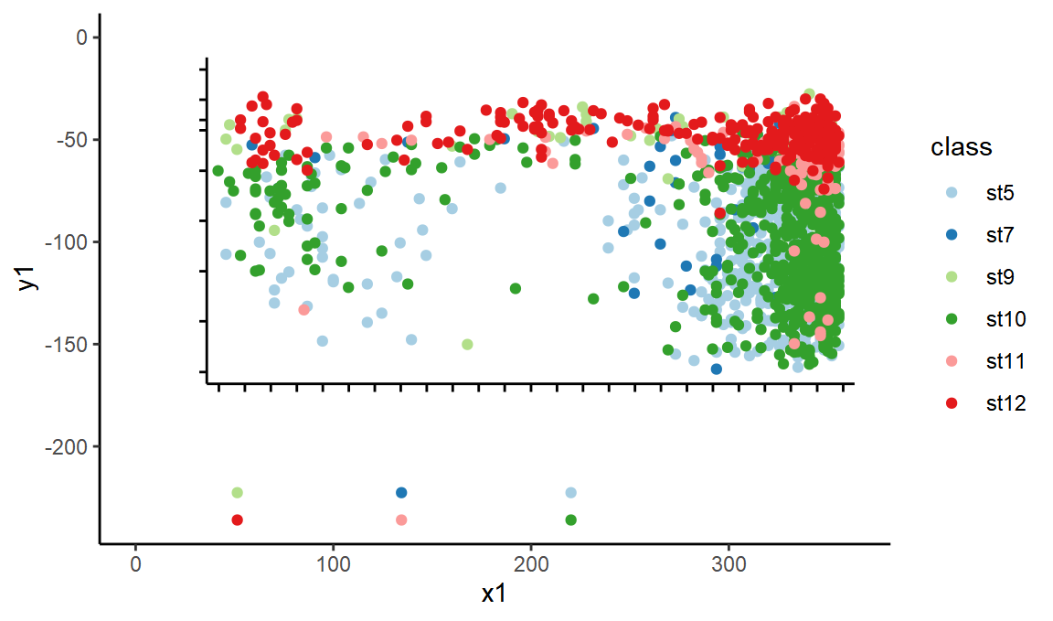
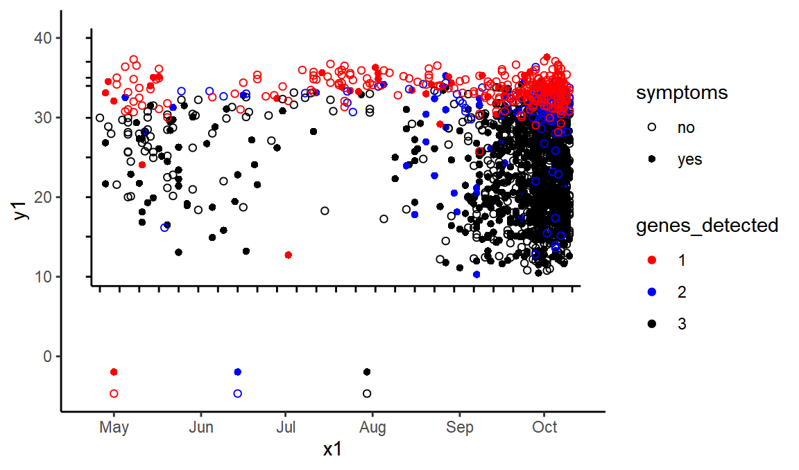
Conveniently, the points in the key are still there, so we can easily label these classes with their correct metadata
genes_detected <- c(1, 1, 2, 2, 3, 3)
symptoms <- c("yes", "no", "yes", "no", "yes", "no")
classes <- c("st9", "st12", "st7", "st11", "st5", "st10")

class_info <- tibble(class = classes, symptoms = symptoms, genes_detected = genes_detected)

points_detail <- points %>%
  inner_join(class_info) %>%
  mutate(genes_detected = as.factor(genes_detected))

#> Joining, by = "class"


ggplot(black_lines, aes(x = x1, xend = x2, y = y1, yend = y2)) +
  geom_segment() +
  geom_point(data = points_detail %>% mutate(x2 = 0, y2 = 0), aes(x = x, y = y, color = genes_detected, shape = symptoms)) +
  scale_color_manual(values = c("red", "blue", "black"))+scale_shape_manual(values=c(1,16))
We’re getting there! We have recreated the chart within our ggplot.
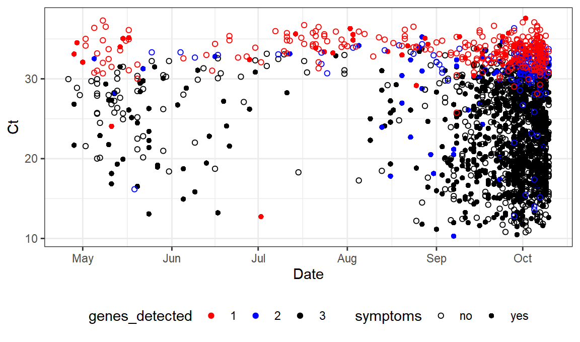
Now we just need to transform ourselves into the right axes:
transform <- function(vector, a_in, a_out, b_in, b_out) {
  scaling <- (b_out - a_out) / (b_in - a_in)
  vector <- (vector - a_in) * scaling + a_out
  return(vector)
}

ytransform <- partial(transform, a_in = y_min_svg, a_out = y_min_real, b_in = y_max_svg, b_out = y_max_real)
xtransform <- partial(transform, a_in = x_min_svg, a_out = x_min_real, b_in = x_max_svg, b_out = x_max_real)

new_axes <- black_lines %>% mutate(y1 = ytransform(y1), y2 = ytransform(y2), x1 = xtransform(x1), x2 = xtransform(x2))
points_transformed <- points_detail %>% mutate(y = ytransform(y), x = xtransform(x))

ggplot(new_axes, ) +
  geom_segment(aes(x = x1, xend = x2, y = y1, yend = y2)) +
  geom_point(data = points_transformed %>% mutate(x2 = ymd("2020-01-01"), y2 = ymd("2020-01-01")), aes(x = x, y = y, color = genes_detected, shape = symptoms)) +
  scale_color_manual(values = c("red", "blue", "black"))+scale_shape_manual(values=c(1,16))
OK, the coordinates look right. At this point we can throw away the old axes and just focus on the points.
values <- points_transformed %>%
  filter(y > 0) %>%
  mutate(Date = x, Ct = y) %>%
  select(-x, -y, -class,-id)

write_csv(values, "ons_ct_value_genes_detected_and_symptoms.csv")
values

#> # A tibble: 1,886 x 4
#>    symptoms genes_detected Date          Ct
#>    <chr>    <fct>          <date>     <dbl>
#>  1 yes      3              2020-04-28  26.8
#>  2 yes      3              2020-04-28  21.7
#>  3 yes      3              2020-05-07  22.9
#>  4 yes      3              2020-05-09  29.4
#>  5 yes      3              2020-05-10  21.8
#>  6 yes      3              2020-05-10  27.3
#>  7 yes      3              2020-05-11  18.1
#>  8 yes      3              2020-05-11  16.8
#>  9 yes      3              2020-05-11  27.3
#> 10 yes      3              2020-05-13  19.3
#> # … with 1,876 more rowsm
There’s our dataset.
And here’s our graph.
ggplot(values,aes(x=Date,y=Ct,color=genes_detected,shape=symptoms)) +
  scale_color_manual(values = c("red", "blue", "black"))+scale_shape_manual(values=c(1,16)) +geom_point()+theme_bw()+ theme(legend.position="bottom")
as compared to:
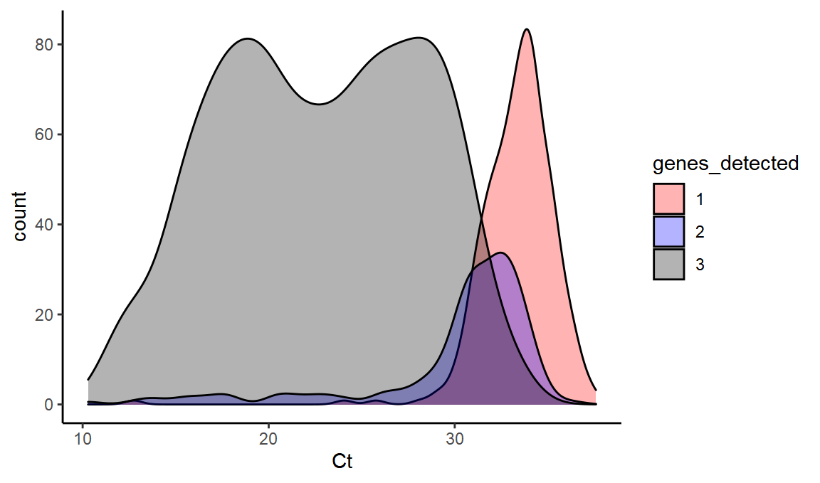
Now we can see what this data can tell us about Ct value distributions:
What is the distribution of 1, 2, and 3 gene positives at different Ct values?
ggplot(values,aes(x=Ct,fill=genes_detected,y=..count..)) +
  scale_fill_manual(values = c("red", "blue", "black")) + geom_density(alpha=0.3)
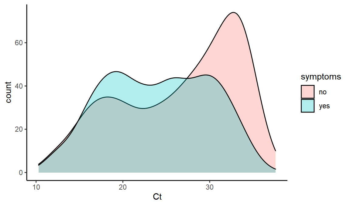
What is the distribution of Ct values with and without symptoms?
ggplot(values,aes(x=Ct,fill=symptoms,y=..count..)) + geom_density(alpha=0.3)
Does symptomatic Ct distribution vary over time?
ggplot(values,aes(x=Date,y=Ct,color=symptoms)) + geom_smooth()

#> `geom_smooth()` using method = 'gam' and formula 'y ~ s(x, bs = "cs")'
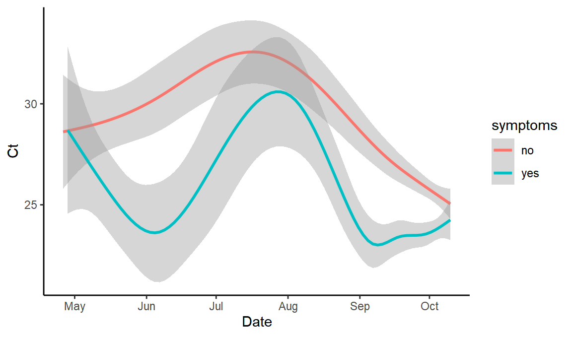
(yes, it does – which I hadn’t especially expected – this may be because it includes symptoms either side of the test at any length of time, so at times of high Ct perhaps people aren’t mostly symptomatic at the time of testing)
Crucially from the point of view of assessing B.1.1.7 proportions, we can calculate how we expect the number of genes detected to change with Ct value for wild-type SARS-CoV2.
ggplot(values,aes(x=Ct,fill=genes_detected,y=..count..)) +
  scale_fill_manual(values = c("red", "blue", "black")) + geom_density(alpha=0.5,position="stack")
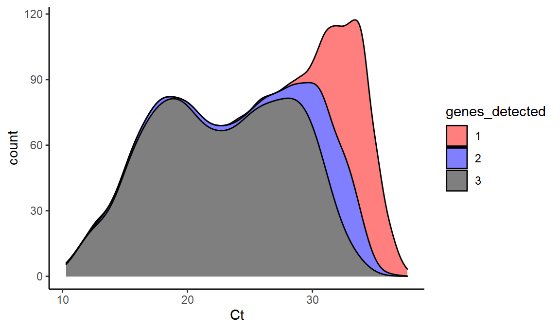
This dataset gives us a sense of how much ‘false positive B.1.1.7’ we might see from random S dropout at a range of different Ct values (i.e. the 2 values might be predominantly this).
And we can even simulate what B.1.1.7 would look like under these conditions. We know that it is very rare to see the S positive unless OR and N are both also positive. So essentially B.1.1.7 SGTF would just turn 3 into 2 here.
simul_b117 = values %>% mutate(genes_detected=ifelse(genes_detected=="3","2",genes_detected)) %>% filter(genes_detected>0)


ggplot(simul_b117,aes(x=Ct,fill=genes_detected,y=..count..)) +
  scale_fill_manual(values = c("red", "blue", "black")) + geom_density(alpha=0.5,position="stack")
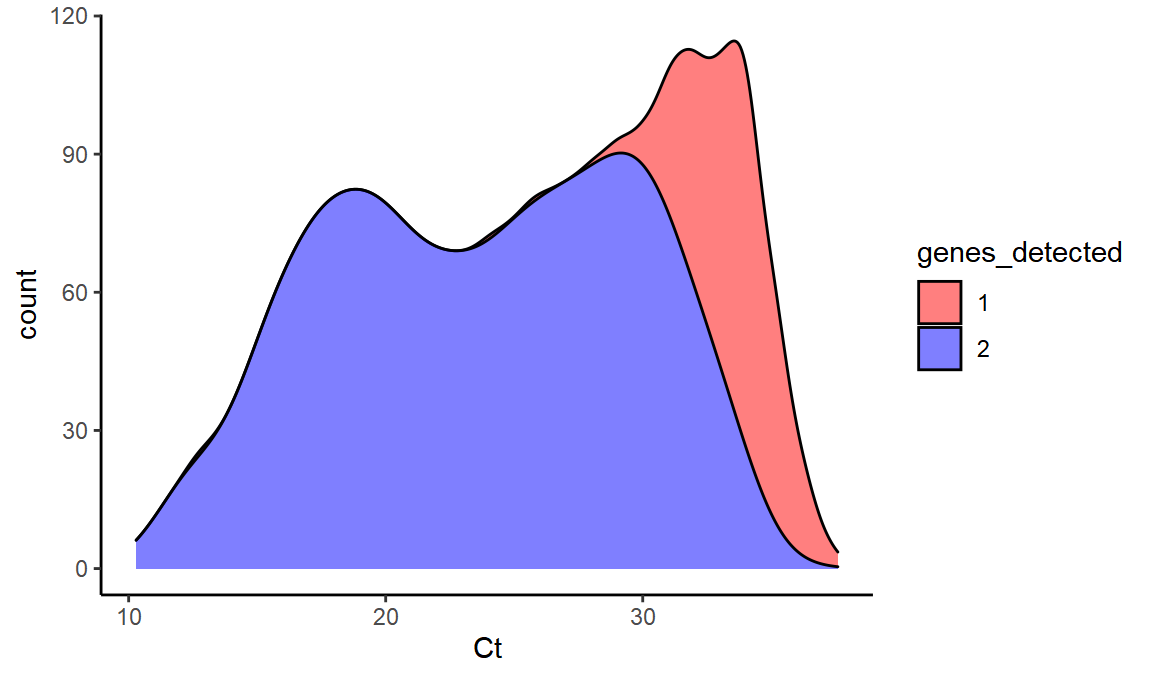
We can see that at high Ct, we see a lot of the single gene OR or N.
With the median Ct value around 31 in recent weeks, this can help to explain the presence of single gene positive samples that were previously called as not-compatible with the new variant.
Conclusion
We’ve been able to convert a valuable dataset generated by the ONS Infection Survey team into a machine-readable form, which permits insights into the apparent relative decline of B.1.1.7 in the recent report. Hopefully this can provide a useful building block in downstream analyses of Ct, gene dropout, and temporal dynamics.
If you enjoyed this exploration of how to extract data from vector-graphics in R, you might also want to see my extraction of data from a rasterised chloropleth map.
Theo Sanderson
Assistant Professor
Biologist developing tools to scale pathogen genetics.