Five lines of R
Somebody on Twitter asked me whether B.1.1.7 data from Florida was still compatible with a logistic increase.
It’s amazing how simple this sort of thing is to look at with the Tidyverse and nicely formatted SGTF data from Helix.
library(tidyverse)
data = read_csv(url("https://raw.githubusercontent.com/myhelix/helix-covid19db/master/counts_by_state.csv"))
state_selection = (data %>% group_by(state) %>% summarise(total=sum(positive)) %>% filter(total>5000))$state
data = data  %>% mutate(percent_sgtf=all_SGTF/positive) %>% filter(state %in% state_selection)
ggplot(data,aes(x=collection_date, y=percent_sgtf))+geom_point()+ stat_smooth(method = "glm", method.args = list(family = "binomial"), se = FALSE,  fullrange=TRUE) +xlim(lubridate::ymd("2020-12-01"),lubridate::ymd("2021-04-30"))+labs(title="US SGTF",x="Date",y="Percent SGTF")+facet_wrap(~state)+theme_bw()+scale_y_continuous(label=scales::percent)
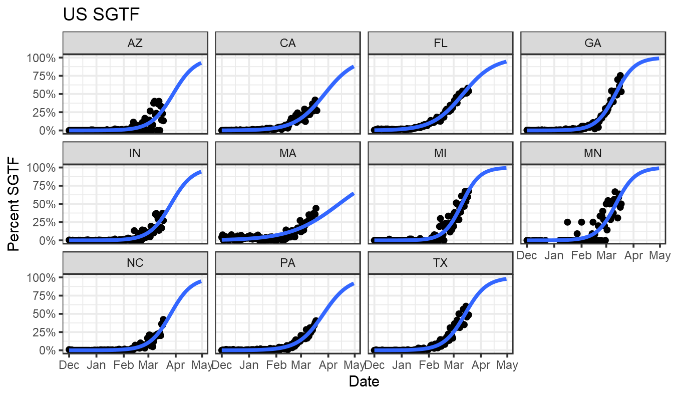
There are lots of ways one could improve this, bringing in genome data and modelling uncertainty, but it provides a quick look at what’s happening.
Addendum
Despite the title, I decided to extend this a bit. Let’s first do as above but take rolling averages of SGTF across 7-day intervals:
library(tidyverse)
library(zoo)
data = read_csv(url("https://raw.githubusercontent.com/myhelix/helix-covid19db/master/counts_by_state.csv"))
state_selection = (data %>% group_by(state) %>% summarise(total=sum(positive)) %>% filter(total>5000))$state
data = data  %>% filter(state %in% state_selection) %>% arrange(collection_date) %>% group_by(state) %>% mutate(all_SGTF = rollsum(all_SGTF,7,na.pad=T),  positive=rollsum(positive,7,na.pad=T), percent_sgtf=all_SGTF/positive)

#ggplot(data,aes(x=collection_date, y=percent_sgtf))+geom_point()+ stat_smooth(method = "glm", method.args = list(family = "binomial"), se = FALSE,  fullrange=TRUE) +xlim(lubridate::ymd("2020-12-01"),lubridate::ymd("2021-04-30"))+labs(x="Date",y="Percent SGTF")+facet_wrap(~state)+theme_bw()+scale_y_continuous(label=scales::percent)
And now bring in case data from the New York Times and split these cases by likely SGTF status.
case_data = read_csv(url("https://raw.githubusercontent.com/nytimes/covid-19-data/master/us-states.csv")) %>% rename(State=state)

case_data= case_data %>% group_by(State) %>% arrange(date) %>% mutate(daily_cases=cases-lag(cases)) %>% mutate(smoothed_daily_cases=rollmean(daily_cases,k=7,na.pad=T))
case_data = read_csv(url("https://raw.githubusercontent.com/jasonong/List-of-US-States/master/states.csv"))%>% inner_join(case_data)
together = data %>% inner_join(case_data,by = c("collection_date"="date","state"="Abbreviation")) %>% mutate(`SGTF cases` = percent_sgtf * smoothed_daily_cases, `non-SGTF cases` = (1-percent_sgtf) * smoothed_daily_cases) %>% select(State,collection_date,`SGTF cases`,`non-SGTF cases`)  %>% pivot_longer(c(`SGTF cases`,`non-SGTF cases`))
ggplot(together %>% filter(value>0),aes(x=collection_date, y=value,color=name))+geom_line()+labs(title="US daily cases by SGTF status",x="Date",y="Daily cases",color="Type")+facet_wrap(~State)+theme_bw()+xlim(lubridate::ymd("2021-1-01"),NA)+scale_y_log10()+scale_color_manual(values=c("blue","red"))+coord_cartesian(ylim=c(10,10000))
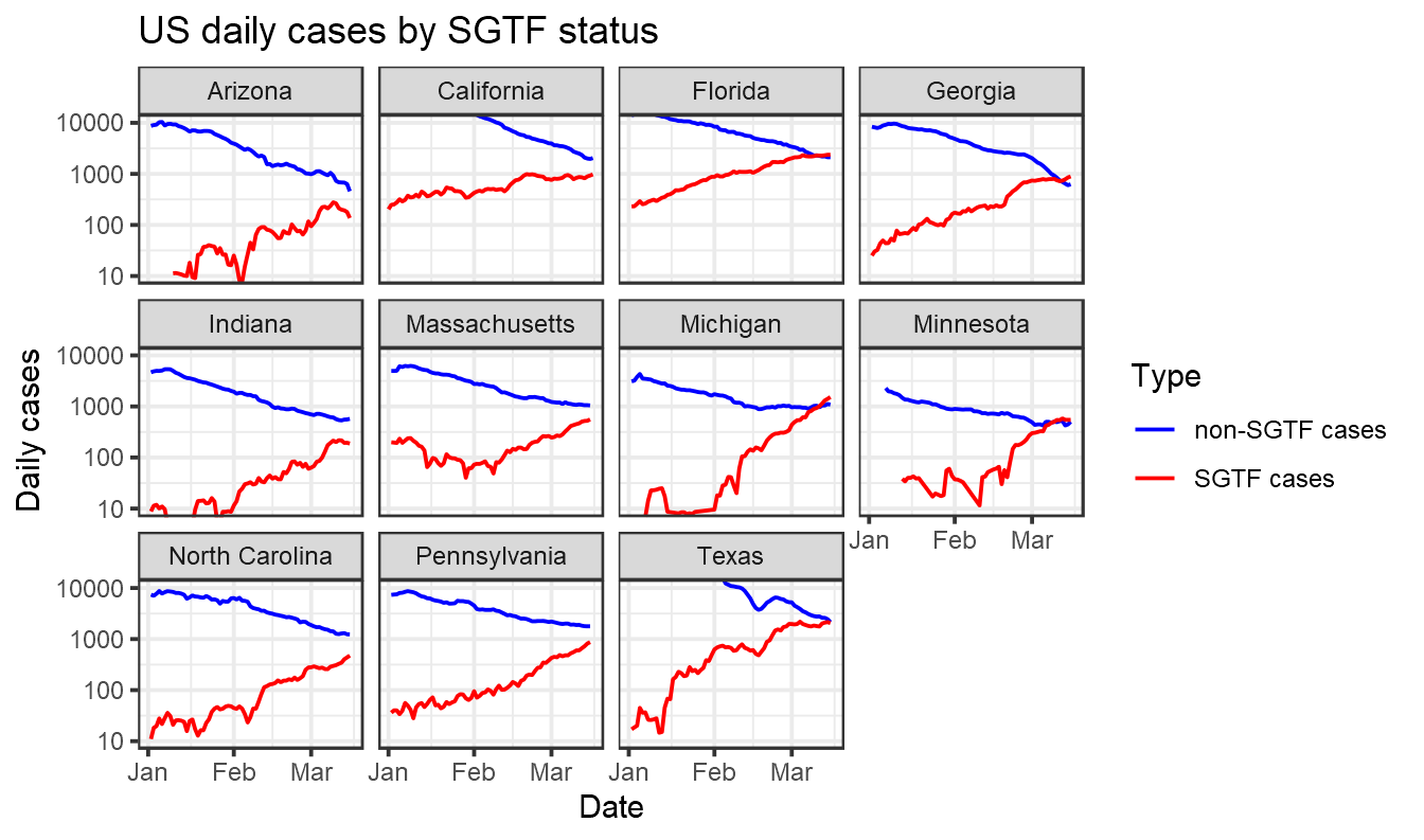
Note that in the graph above we are relying here on SGTF data from one company, Helix, and then assuming it is representative of all cases in a state. This may not be an accurate assumption, as noted by Marm Kilpatrick. Interpret with caution.
Theo Sanderson
Assistant Professor
Biologist developing tools to scale pathogen genetics.